Syncfusion.Blazor.Navigations 30.1.41
Syncfusion® Blazor Navigation Components
This package contains Blazor TreeView,Blazor Dropdown Tree, Blazor Tab, Blazor Menu Bar, Blazor Sidebar, Blazor Accordion, Blazor Breadcrumb, Blazor Toolbar, Blazor Context Menu, Blazor Carousel, Blazor AppBar and Blazor Stepper components for Blazor application.
System Requirements
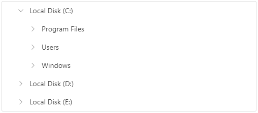
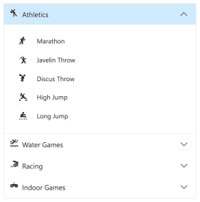
Blazor TreeView
The Blazor TreeView is a graphical user interface component that allows you to represent hierarchical data in a tree-like structure. This component has advanced features like load on demand, multiple selection, tree navigation, drag and drop, tree node editing, and check box and template support that improve the performance greatly.
Getting Started
Resources
- Blazor TreeView Component Features Overview
- Blazor TreeView Component Documentation
- Blazor TreeView Component Demos
- Blazor TreeView Component Video Tutorials
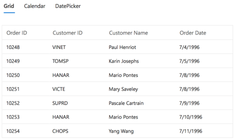
Blazor Tab
The Blazor Tab component is a simple user interface (tabs UI) for organizing related content and occupying a compact space. The Blazor tab are aligned horizontally, and each tab is associated with its header. One of the tabs must always be selected and visible. The Blazor Tab component has a rich set of features such as animation, orientation, templating, header styles, a close button for each tab, a scrollbar or pop-up when there are many tabs and more.
Getting Started
Resources
- Blazor Tab Component Features Overview
- Blazor Tab Component Documentation
- Blazor Tab Component Demos
- Blazor Tab Component Video Tutorials
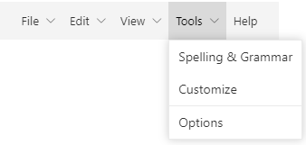
Blazor Menu Bar
The Blazor Menu Bar is a graphical user interface component that serves as a navigation header for your web application or site. It supports data binding, templates, icons, multilevel nesting, and horizontal and vertical menus.
Getting Started
Resources
- Blazor Menu Bar Component Features Overview
- Blazor Menu Bar Component Documentation
- Blazor Menu Bar Component Demos
- Blazor Menu Bar Component Video Tutorials
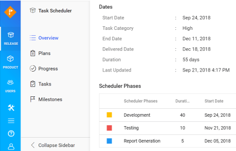
Blazor Sidebar
The Blazor Sidebar is an expandable and collapsible component that typically acts as a side container to place primary or secondary content alongside the main content. It provides flexible options to be shown and hidden based on user interactions. Any type of HTML content or component can be placed in the Blazor Sidebar for quick access and for easy navigation, like quick references, menus, lists, and tree views.
Getting Started
Resources
- Blazor Sidebar Component Features Overview
- Blazor Sidebar Component Documentation
- Blazor Sidebar Component Demos
Blazor Accordion
The Blazor Accordion is a container-based component with vertically collapsible panels (vertical accordion) and stacked headers that expand or collapse one or more panels at a time within the available space.
Getting Started
Resources
- Blazor Accordion Component Features Overview
- Blazor Accordion Component Documentation
- Blazor Accordion Component Demos
- Blazor Accordion Component Video Tutorials
Blazor Breadcrumb
The Blazor Breadcrumb is a graphical user interface that helps to identify or highlight the current location within a hierarchical structure of websites. The aim is to make the user aware of their current position in a hierarchy of website links.

Getting Started
Resources
- Blazor Breadcrumb Component Features Overview
- Blazor Breadcrumb Component Documentation
- Blazor Breadcrumb Component Demos
Blazor Toolbar
The Blazor Toolbar is a feature-rich component that provides an interface for selecting a command from a collection of commands. It has a rich set of features such as different orientations, responsive modes (scrollable and pop-up), templating, and button alignment based on priority.

Getting Started
Resources
- Blazor Toolbar Component Features Overview
- Blazor Toolbar Component Documentation
- Blazor Toolbar Component Demos
- Blazor Toolbar Component Video Tutorials
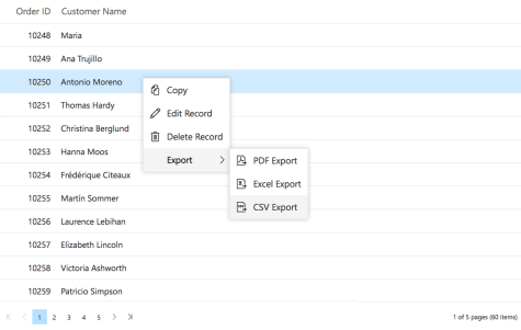
Blazor Context Menu
The Blazor Context Menu is a graphical user interface component that appears when the user right-clicks or performs a touch and hold action. You can define the list of items the context menu will contain, create multilevel menus, and attach event handlers to the menu items for seamless integration with other controls.
Getting Started
Resources
- Blazor Context Menu Component Features Overview
- Blazor Context Menu Component Documentation
- Blazor Context Menu Component Demos
- Blazor Context Menu Component Video Tutorials
Blazor Carousel
The Blazor Carousel component allows users to display images with content, links, etc., like a slide show. Typical uses of carousels include scrolling news headlines, featured articles on home pages, and image galleries.

Getting Started
Resources
- Blazor Carousel Component Features Overview
- Blazor Carousel Component Documentation
- Blazor Carousel Component Demos
- Blazor Carousel Component Video Tutorials
Blazor AppBar
The Blazor AppBar displays information and actions related to the current application screen. It is used to show branding, screen titles, navigation, and actions.
Getting Started

Resources
- Blazor AppBar Component Features Overview
- Blazor AppBar Component Documentation
- Blazor AppBar Component Demos
- Blazor AppBar Component Video Tutorials
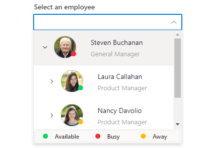
Blazor Dropdown Tree
The Blazor Dropdown Tree component is a text-box component that allows users to select a single value or multiple values from hierarchical data in a tree-like structure. It has several out-of-the-box features, such as data binding, checkboxes, templates, UI customization, accessibility, and preselected values.
Getting Started
Resources
- Blazor Dropdown Tree Component Features Overview
- Blazor Dropdown Tree Component Documentation
- Blazor Dropdown Tree Component Demos
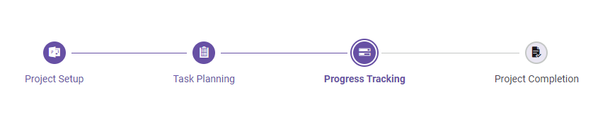
Blazor Stepper
The Blazor Stepper component enables users to navigate through a series of steps or stages in a process within a web application. Stepper displays a list of steps with the current step highlighted, allowing users to move between steps. It includes several built-in features, such as different step types, orientation, linear flow, label positions, and template customization.
Getting Started
Resources
- Blazor Stepper Component Features Overview
- Blazor Stepper Component Documentation
- Blazor Stepper Component Demos
Support and feedback
- For any other queries, reach our Syncfusion® support team or post the queries through the community forums.
- Provide feature request through the Syncfusion® feedback portal
License
This is a commercial product and requires a paid license for possession or use. Syncfusion® licensed software, including this component, is subject to the terms and conditions of Syncfusion® EULA. You can purchase a license here or start a free 30-day trial here.
About Syncfusion®
Founded in 2001 and headquartered in Research Triangle Park, N.C., Syncfusion® has more than 29,000 customers and more than 1 million users, including large financial institutions, Fortune 500 companies, and global IT consultancies.
Today, we provide 1800+ components and frameworks for web (Blazor, ASP.NET Core, ASP.NET MVC, ASP.NET WebForms, JavaScript, Angular, React, Vue, and Flutter), mobile (Xamarin, Flutter, UWP, and JavaScript), and desktop development (WinForms, WPF, WinUI, Flutter and UWP). We provide ready-to-deploy enterprise software for dashboards, reports, data integration, and big data processing. Many customers have saved millions in licensing fees by deploying our software.
sales@syncfusion.com | www.syncfusion.com | Toll Free: 1-888-9 DOTNET
Showing the top 20 packages that depend on Syncfusion.Blazor.Navigations.
| Packages | Downloads |
|---|---|
|
Syncfusion.Blazor.Grid
This package provides the functionality to utilize the features of Syncfusion Blazor DataGrid component and more.
|
6 |
|
Syncfusion.Blazor.FileManager
This package provides the functionality to utilize the features of Syncfusion Blazor File Manager component and more.
|
5 |
|
Syncfusion.Blazor.PivotTable
This package provides the functionality to utilize the features of Syncfusion® Blazor Pivot Table component and more.
|
5 |
|
Syncfusion.Blazor.Grid
This package provides the functionality to utilize the features of Syncfusion Blazor DataGrid component and more.
|
5 |
|
Syncfusion.Blazor.Grid
The Blazor DataGrid component is used to display and manipulate tabular data with configuration options to control the way the data is presented. It can pull data from data sources such as IEnumerable objects, OData web services, or DataManager and binding data fields to columns. It also displays the column header to identify the field with support for grouped records.The most important features available in the datagrid component are paging, sorting, filtering, searching, and grouping.
Key Features
• Data sources: Binds the datagrid component with IEnumerable, DataManager or perform manual data binding.
• Sorting and grouping: Supports n level of sorting and grouping.
• Filtering: Offers filter bar in each column to filter data.
• Paging: Allows easy switching between pages using the pager bar.
• Editing: Provides the options for create, read, update, and delete operations.
• Columns: The column definitions are used as the dataSource schema in the DataGrid. This plays a vital role in rendering column values in the required format.
o Reordering: Allows drag and drop of any column anywhere in the grid’s column header row, thus allowing repositioning of columns.
o Column Chooser: The column chooser provides a list of column names paired with check boxes that allow the visibility to be toggled on the fly.
o Resizing: Resizing allows changing column width on the fly by simply dragging the right corner of the column header.
o Freeze: Columns and rows can be frozen to allow scrolling and comparing cell values.
o Foreign data source: This provides the option to show values from external or lookup data sources in a column based on foreign key/value mapping.
• Selection: Rows or cells can be selected in the datagrid. One or more rows or cells can also be selected by holding Ctrl or Command, or programmatically.
• Aggregation: Provides the option to easily visualized the Aggregates for column values.
• Context menu: The context menu provides a list of actions to be performed in the datagrid. It appears when a cell, header, or the pager is right-clicked.
• Clipboard: Selected rows and cells can be copied from the datagrid
• Export: Provides the options to Export the datagrid data to Excel, PDF, and CSV formats.
• RTL support: Provides right-to-left mode that aligns the datagrid content from right to left.
• Localization: Provides an inherent support to localize the UI.
• Live Updates: Optimized for handling live data updates.
• Master Detail Grid: The detail grid shows the corresponding child information of the selected parent grid record.
Helpful links:
Feature tour: https://www.syncfusion.com/blazor-components/blazor-datagrid?utm_source=nuget&utm_medium=listing
Documentation: https://blazor.syncfusion.com/documentation/datagrid/?utm_source=nuget&utm_medium=listing
Demos: https://blazor.syncfusion.com/demos/datagrid/overview?utm_source=nuget&utm_medium=listing
Support:
Incident: https://www.syncfusion.com/support/directtrac/incidents/newincident/?utm_source=nuget&utm_medium=listing
Forum: https://www.syncfusion.com/forums/blazor-components/?utm_source=nuget&utm_medium=listing
This is a commercial product and requires a paid license for possession or use. Syncfusion’s licensed software, including this component, is subject to the terms and conditions of Syncfusion's EULA (https://www.syncfusion.com/eula/es/). To acquire a license, you can purchase one at https://www.syncfusion.com/sales/products or start a free 30-day trial here (https://www.syncfusion.com/account/manage-trials/start-trials).
© Copyright 2021 Syncfusion, Inc. All Rights Reserved. The Syncfusion Essential Studio license and copyright applies to this distribution.
|
5 |
|
Syncfusion.Blazor.PdfViewer
This package provides the functionality to utilize the features of Syncfusion Blazor PDF Viewer component and more.
|
5 |
|
Syncfusion.Blazor.PivotTable
This package provides the functionality to utilize the features of Syncfusion Blazor Pivot Table component and more.
|
4 |
|
Syncfusion.Blazor.PdfViewer
This package provides the functionality to utilize the features of Syncfusion Blazor PDF Viewer component and more.
|
4 |
|
Syncfusion.Blazor.FileManager
This package provides the functionality to utilize the features of Syncfusion Blazor File Manager component and more.
|
4 |
|
Syncfusion.Blazor.PivotTable
This package provides the functionality to utilize the features of Syncfusion® Blazor Pivot Table component and more.
|
4 |
.NET 8.0
- Syncfusion.Blazor.Buttons (>= 30.1.41)
- Syncfusion.Blazor.Popups (>= 30.1.41)
- Syncfusion.Blazor.Lists (>= 30.1.41)
- Syncfusion.Blazor.Inputs (>= 30.1.41)
- Syncfusion.Blazor.DropDowns (>= 30.1.41)
- Syncfusion.Blazor.Data (>= 30.1.41)
- Syncfusion.Blazor.Core (>= 30.1.41)
- Syncfusion.Blazor.Spinner (>= 30.1.41)
.NET 9.0
- Syncfusion.Blazor.Spinner (>= 30.1.41)
- Syncfusion.Blazor.Popups (>= 30.1.41)
- Syncfusion.Blazor.Lists (>= 30.1.41)
- Syncfusion.Blazor.Inputs (>= 30.1.41)
- Syncfusion.Blazor.DropDowns (>= 30.1.41)
- Syncfusion.Blazor.Data (>= 30.1.41)
- Syncfusion.Blazor.Buttons (>= 30.1.41)
- Syncfusion.Blazor.Core (>= 30.1.41)
| Version | Downloads | Last updated |
|---|---|---|
| 30.1.42 | 1 | 8/1/2025 |
| 30.1.41 | 1 | 8/1/2025 |
| 30.1.40 | 2 | 7/17/2025 |
| 30.1.39 | 2 | 7/19/2025 |
| 30.1.38 | 2 | 7/2/2025 |
| 30.1.37 | 2 | 7/1/2025 |
| 29.2.11 | 2 | 7/2/2025 |
| 29.2.10 | 2 | 7/2/2025 |
| 29.2.9 | 2 | 7/4/2025 |
| 29.2.8 | 2 | 7/1/2025 |
| 29.2.7 | 2 | 7/5/2025 |
| 29.2.5 | 2 | 7/3/2025 |
| 29.2.4 | 2 | 7/5/2025 |
| 29.1.41 | 2 | 7/3/2025 |
| 29.1.40 | 2 | 7/5/2025 |
| 29.1.39 | 2 | 7/1/2025 |
| 29.1.38 | 2 | 7/4/2025 |
| 29.1.37 | 2 | 7/17/2025 |
| 29.1.35 | 2 | 7/2/2025 |
| 29.1.33 | 2 | 7/2/2025 |
| 28.2.12 | 2 | 7/3/2025 |
| 28.2.11 | 2 | 7/1/2025 |
| 28.2.9 | 3 | 3/8/2025 |
| 28.2.7 | 3 | 2/28/2025 |
| 28.2.6 | 3 | 2/28/2025 |
| 28.2.5 | 3 | 2/28/2025 |
| 28.2.4 | 3 | 2/28/2025 |
| 28.2.3 | 3 | 2/28/2025 |
| 28.1.41 | 3 | 2/28/2025 |
| 28.1.39 | 3 | 2/28/2025 |
| 28.1.38 | 3 | 2/28/2025 |
| 28.1.37 | 3 | 2/28/2025 |
| 28.1.36 | 3 | 2/28/2025 |
| 28.1.35 | 4 | 2/28/2025 |
| 28.1.33 | 3 | 2/27/2025 |
| 27.2.5 | 4 | 2/28/2025 |
| 27.2.4 | 3 | 2/28/2025 |
| 27.2.3 | 3 | 2/28/2025 |
| 27.2.2 | 3 | 2/27/2025 |
| 27.1.58 | 4 | 3/2/2025 |
| 27.1.57 | 3 | 2/28/2025 |
| 27.1.56 | 3 | 3/2/2025 |
| 27.1.55 | 3 | 2/28/2025 |
| 27.1.53 | 3 | 2/28/2025 |
| 27.1.52 | 3 | 2/28/2025 |
| 27.1.51 | 3 | 2/28/2025 |
| 27.1.50 | 3 | 3/2/2025 |
| 27.1.48 | 3 | 3/2/2025 |
| 26.2.14 | 3 | 2/28/2025 |
| 26.2.13 | 3 | 2/28/2025 |
| 26.2.12 | 3 | 2/27/2025 |
| 26.2.11 | 3 | 2/27/2025 |
| 26.2.10 | 3 | 2/28/2025 |
| 26.2.9 | 3 | 2/28/2025 |
| 26.2.8 | 3 | 2/28/2025 |
| 26.2.7 | 3 | 2/28/2025 |
| 26.2.5 | 3 | 2/28/2025 |
| 26.2.4 | 3 | 2/28/2025 |
| 26.1.42 | 3 | 2/28/2025 |
| 26.1.41 | 3 | 2/28/2025 |
| 26.1.40 | 3 | 3/2/2025 |
| 26.1.39 | 3 | 2/28/2025 |
| 26.1.38 | 3 | 2/28/2025 |
| 26.1.35 | 3 | 2/28/2025 |
| 25.2.7 | 3 | 2/28/2025 |
| 25.2.6 | 2 | 2/28/2025 |
| 25.2.5 | 3 | 2/27/2025 |
| 25.2.4 | 3 | 2/28/2025 |
| 25.2.3 | 3 | 2/28/2025 |
| 25.1.42 | 3 | 2/28/2025 |
| 25.1.41 | 3 | 2/28/2025 |
| 25.1.40 | 3 | 3/2/2025 |
| 25.1.39 | 3 | 2/28/2025 |
| 25.1.38 | 3 | 2/28/2025 |
| 25.1.37 | 3 | 2/28/2025 |
| 25.1.35 | 3 | 2/28/2025 |
| 24.2.9 | 3 | 2/28/2025 |
| 24.2.8 | 3 | 2/28/2025 |
| 24.2.7 | 3 | 2/28/2025 |
| 24.2.6 | 3 | 2/28/2025 |
| 24.2.5 | 3 | 2/28/2025 |
| 24.2.4 | 3 | 2/27/2025 |
| 24.2.3 | 3 | 2/28/2025 |
| 24.1.47 | 3 | 2/28/2025 |
| 24.1.46 | 3 | 2/28/2025 |
| 24.1.45 | 3 | 2/28/2025 |
| 24.1.44 | 3 | 2/27/2025 |
| 24.1.43 | 3 | 2/28/2025 |
| 24.1.41 | 3 | 2/27/2025 |
| 23.2.7 | 3 | 2/28/2025 |
| 23.2.6 | 3 | 2/28/2025 |
| 23.2.5 | 3 | 2/28/2025 |
| 23.2.4 | 3 | 2/28/2025 |
| 23.1.44 | 3 | 2/28/2025 |
| 23.1.43 | 3 | 2/27/2025 |
| 23.1.42 | 3 | 2/28/2025 |
| 23.1.41 | 3 | 2/28/2025 |
| 23.1.40 | 3 | 2/28/2025 |
| 23.1.39 | 3 | 2/27/2025 |
| 23.1.38 | 3 | 2/27/2025 |
| 23.1.36 | 3 | 2/27/2025 |
| 22.2.12 | 3 | 2/27/2025 |
| 22.2.11 | 3 | 2/27/2025 |
| 22.2.10 | 4 | 2/27/2025 |
| 22.2.9 | 3 | 2/27/2025 |
| 22.2.8 | 3 | 2/27/2025 |
| 22.2.7 | 3 | 2/27/2025 |
| 22.2.5 | 3 | 2/27/2025 |
| 22.1.39 | 3 | 2/28/2025 |
| 22.1.38 | 3 | 2/28/2025 |
| 22.1.37 | 3 | 2/28/2025 |
| 22.1.36 | 3 | 2/28/2025 |
| 22.1.34 | 3 | 2/28/2025 |
| 21.2.10 | 3 | 2/27/2025 |
| 21.2.9 | 3 | 2/28/2025 |
| 21.2.8 | 3 | 2/28/2025 |
| 21.2.6 | 3 | 2/28/2025 |
| 21.2.5 | 3 | 2/28/2025 |
| 21.2.4 | 2 | 2/28/2025 |
| 21.2.3 | 3 | 2/28/2025 |
| 21.1.41 | 3 | 2/27/2025 |
| 21.1.39 | 3 | 2/28/2025 |
| 21.1.38 | 3 | 2/28/2025 |
| 21.1.37 | 3 | 2/28/2025 |
| 21.1.35 | 3 | 2/28/2025 |
| 20.4.0.54 | 3 | 3/5/2025 |
| 20.4.0.53 | 3 | 3/5/2025 |
| 20.4.0.52 | 3 | 3/5/2025 |
| 20.4.0.51 | 3 | 3/5/2025 |
| 20.4.0.50 | 3 | 3/5/2025 |
| 20.4.0.49 | 4 | 3/5/2025 |
| 20.4.0.48 | 3 | 3/5/2025 |
| 20.4.0.44 | 3 | 2/28/2025 |
| 20.4.0.43 | 3 | 2/28/2025 |
| 20.4.0.42 | 3 | 2/28/2025 |
| 20.4.0.41 | 3 | 3/5/2025 |
| 20.4.0.40 | 3 | 2/28/2025 |
| 20.4.0.38 | 3 | 3/5/2025 |
| 20.3.0.61 | 4 | 3/5/2025 |
| 20.3.0.60 | 3 | 2/28/2025 |
| 20.3.0.59 | 3 | 3/5/2025 |
| 20.3.0.58 | 3 | 3/5/2025 |
| 20.3.0.57 | 3 | 3/5/2025 |
| 20.3.0.56 | 3 | 3/5/2025 |
| 20.3.0.52 | 3 | 2/28/2025 |
| 20.3.0.50 | 3 | 2/28/2025 |
| 20.3.0.49 | 5 | 8/30/2023 |
| 20.3.0.48 | 3 | 3/5/2025 |
| 20.3.0.47 | 3 | 3/5/2025 |
| 20.2.0.50 | 3 | 2/28/2025 |
| 20.2.0.49 | 3 | 3/5/2025 |
| 20.2.0.48 | 3 | 3/5/2025 |
| 20.2.0.46 | 3 | 3/5/2025 |
| 20.2.0.45 | 3 | 3/5/2025 |
| 20.2.0.44 | 3 | 2/28/2025 |
| 20.2.0.43 | 3 | 2/28/2025 |
| 20.2.0.40 | 3 | 2/28/2025 |
| 20.2.0.39 | 3 | 2/28/2025 |
| 20.2.0.38 | 3 | 2/28/2025 |
| 20.2.0.36 | 3 | 2/28/2025 |
| 20.1.0.61 | 3 | 3/5/2025 |
| 20.1.0.60 | 3 | 3/5/2025 |
| 20.1.0.59 | 3 | 3/5/2025 |
| 20.1.0.58 | 4 | 1/4/2025 |
| 20.1.0.57 | 3 | 3/5/2025 |
| 20.1.0.56 | 3 | 3/5/2025 |
| 20.1.0.55 | 3 | 3/5/2025 |
| 20.1.0.52 | 3 | 3/5/2025 |
| 20.1.0.51 | 3 | 3/5/2025 |
| 20.1.0.50 | 3 | 3/5/2025 |
| 20.1.0.48 | 3 | 3/5/2025 |
| 20.1.0.47 | 3 | 3/5/2025 |
| 19.4.0.56 | 3 | 3/5/2025 |
| 19.4.0.55 | 3 | 3/5/2025 |
| 19.4.0.54 | 3 | 3/5/2025 |
| 19.4.0.53 | 3 | 3/5/2025 |
| 19.4.0.52 | 3 | 3/5/2025 |
| 19.4.0.50 | 3 | 3/5/2025 |
| 19.4.0.48 | 4 | 3/5/2025 |
| 19.4.0.47 | 3 | 3/5/2025 |
| 19.4.0.43 | 4 | 3/5/2025 |
| 19.4.0.42 | 3 | 3/5/2025 |
| 19.4.0.41 | 3 | 3/5/2025 |
| 19.4.0.40 | 3 | 3/5/2025 |
| 19.4.0.38 | 3 | 3/5/2025 |
| 19.3.0.59 | 3 | 3/5/2025 |
| 19.3.0.57 | 3 | 3/5/2025 |
| 19.3.0.56 | 3 | 3/5/2025 |
| 19.3.0.55 | 3 | 3/5/2025 |
| 19.3.0.54 | 3 | 3/5/2025 |
| 19.3.0.53 | 3 | 3/5/2025 |
| 19.3.0.48 | 3 | 3/5/2025 |
| 19.3.0.47 | 3 | 3/5/2025 |
| 19.3.0.46 | 3 | 3/5/2025 |
| 19.3.0.45 | 3 | 3/5/2025 |
| 19.3.0.44 | 3 | 3/5/2025 |
| 19.3.0.43 | 3 | 3/5/2025 |
| 19.2.0.62 | 3 | 3/5/2025 |
| 19.2.0.60 | 3 | 3/5/2025 |
| 19.2.0.59 | 3 | 3/5/2025 |
| 19.2.0.57 | 3 | 3/5/2025 |
| 19.2.0.56 | 3 | 3/5/2025 |
| 19.2.0.55 | 3 | 3/5/2025 |
| 19.2.0.51 | 3 | 3/5/2025 |
| 19.2.0.49 | 3 | 3/5/2025 |
| 19.2.0.48 | 3 | 3/5/2025 |
| 19.2.0.47 | 3 | 3/5/2025 |
| 19.2.0.46 | 3 | 3/5/2025 |
| 19.2.0.44 | 3 | 3/5/2025 |
| 19.1.0.69 | 3 | 3/5/2025 |
| 19.1.0.67 | 4 | 3/5/2025 |
| 19.1.0.66 | 3 | 3/5/2025 |
| 19.1.0.65 | 3 | 3/5/2025 |
| 19.1.0.64 | 3 | 3/5/2025 |
| 19.1.0.63 | 3 | 3/5/2025 |
| 19.1.0.59 | 3 | 3/5/2025 |
| 19.1.0.58 | 3 | 3/5/2025 |
| 19.1.0.57 | 3 | 3/5/2025 |
| 19.1.0.56 | 3 | 3/5/2025 |
| 19.1.0.55 | 3 | 3/5/2025 |
| 19.1.0.54 | 3 | 3/5/2025 |
| 18.4.0.49 | 3 | 3/5/2025 |
| 18.4.0.48 | 3 | 3/5/2025 |
| 18.4.0.47 | 3 | 3/5/2025 |
| 18.4.0.46 | 3 | 3/5/2025 |
| 18.4.0.44 | 3 | 3/5/2025 |
| 18.4.0.43 | 3 | 3/5/2025 |
| 18.4.0.42 | 3 | 3/5/2025 |
| 18.4.0.41 | 3 | 3/5/2025 |
| 18.4.0.39 | 3 | 3/5/2025 |
| 18.4.0.35 | 3 | 3/5/2025 |
| 18.4.0.34 | 3 | 3/5/2025 |
| 18.4.0.33 | 3 | 3/5/2025 |
| 18.4.0.32 | 3 | 3/5/2025 |
| 18.4.0.31 | 3 | 3/5/2025 |
| 18.4.0.30 | 3 | 3/5/2025 |