Syncfusion.Blazor.Inputs 30.2.6
Syncfusion® Blazor Input Components
This package contains Blazor Color Picker, Blazor File Upload, Blazor MaskedTextBox, Blazor NumericTextBox, Blazor Range Slider, Blazor TextBox, Blazor SpeechToText and Blazor Rating components for Blazor application.
System Requirements
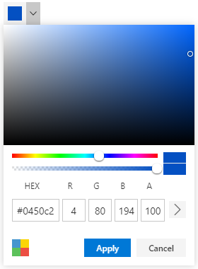
Blazor Color Picker
The Blazor Color Picker component allows you to pick colors either by selecting them from the color picker container or by adjusting the hue and opacity. It supports inline mode, palette customization, and localization for seamless integration into forms.
Getting Started
Resources
- Blazor Color Picker Component Features Overview
- Blazor Color Picker Component Documentation
- Blazor Color Picker Component Demos
- Blazor Color Picker Video Tutorials
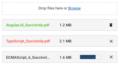
Blazor File Upload
The Blazor File Upload is a component for uploading files, images, documents, and audio and video files to a server. The File Upload works in both WebAssembly and Server-side Blazor apps, and also supports a rich set of features that include multiple file selection, progress bars, auto-uploading, drag and drop, folder (directory) uploading, file validation, and more.
Getting Started
Resources
- Blazor File Upload Component Features Overview
- Blazor File Upload Component Documentation
- Blazor File Upload Component Demos
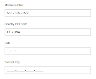
Blazor MaskedTextBox
The Blazor MaskedTextBox is a component that provides an easy and reliable way to collect user input based on a standard mask. It allows you to capture phone numbers, date values, credit card numbers, and other standard format values.
Getting Started
Resources
- Blazor MaskedTextBox Component Features Overview
- Blazor MaskedTextBox Component Documentation
- Blazor MaskedTextBox Component Demos
- Blazor MaskedTextBox Component Video Tutorials
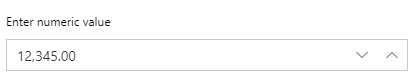
Blazor NumericTextBox
The Blazor NumericTextBox component is a quick replacement of the number-type HTML input element. It’s used to get number inputs from users. It has several out-of-the-box features such as number format support, precision component, and spin buttons.
Getting Started
Resources
- Blazor NumericTextBox Component Features Overview
- Blazor NumericTextBox Component Documentation
- Blazor NumericTextBox Component Demos
- Blazor NumericTextBox Component Video Tutorials
Blazor Signature
The Blazor Signature - Signature component allows user to draw smooth signatures as vector outline of strokes using variable width Bézier curve interpolation. It allows to save signature as image.

Getting Started
Resources
- Blazor Signature Component Features Overview
- Blazor Signature Component Documentation
- Blazor Signature Component Demos
- Blazor Signature Component Video Tutorials
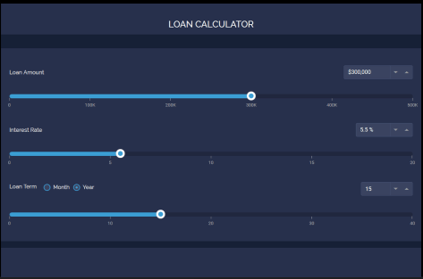
Blazor Range Slider
The Blazor Range Slider is a custom range-type HTML5 input Component. It allows you to select a value or range of values between a specified min and max.
Getting Started
Resources
- Blazor Range Slider Component Features Overview
- Blazor Range Slider Component Documentation
- Blazor Range Slider Component Demos
- Blazor Range Slider Component Video Tutorials
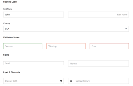
Blazor TextBox
The Blazor TextBox is a component for editing, displaying, or entering plain text on forms to capture user names, phone numbers, email, and more. This component is an extended version of the HTML5 TextBox (input type text) component with icons, floating labels, different sizing, grouping, validation states, and more. It is available in an HTML5/CSS version and a JavaScript version.
Getting Started
Resources
- Blazor TextBox Component Features Overview
- Blazor TextBox Component Documentation
- Blazor TextBox Component Demos
- Blazor TextBox Component Video Tutorials
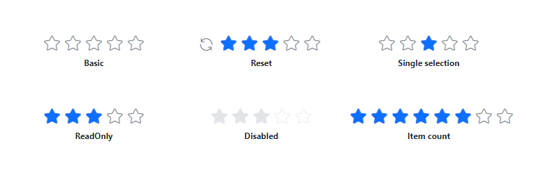
Blazor Rating
The Blazor Rating component is used to provide a star rating or view other people’s ratings on a numeric scale for any service provided, such as for movies, applications, or products. It has several built-in features such as support for precision modes, labels, tooltip, and UI customization.
Getting Started
Resources
- Blazor Rating Component Features Overview
- Blazor Rating Component Documentation
- Blazor Rating Component Demos
- Blazor Rating Component Video Tutorials
Blazor SpeechToText
The Blazor SpeechToText component provides seamless voice-to-text conversion in the web applications. It features real-time transcription with interim results, multilingual recognition, customizable buttons and tooltips, and error handling, ensuring an intuitive and accessible speech recognition experience.

Getting Started
Resources
- Blazor SpeechToText Component Features Overview
- Blazor SpeechToText Component Documentation
- Blazor SpeechToText Component Demos
Support and feedback
- For any other queries, reach our Syncfusion® support team or post the queries through the community forums.
- Provide feature request through the Syncfusion® feedback portal
License
This is a commercial product and requires a paid license for possession or use. Syncfusion® licensed software, including this component, is subject to the terms and conditions of Syncfusion® EULA. You can purchase a license here or start a free 30-day trial here.
About Syncfusion®
Founded in 2001 and headquartered in Research Triangle Park, N.C., Syncfusion® has more than 29,000 customers and more than 1 million users, including large financial institutions, Fortune 500 companies, and global IT consultancies.
Today, we provide 1800+ components and frameworks for web (Blazor, ASP.NET Core, ASP.NET MVC, ASP.NET WebForms, JavaScript, Angular, React, Vue, and Flutter), mobile (Xamarin, Flutter, UWP, and JavaScript), and desktop development (WinForms, WPF, WinUI, Flutter and UWP). We provide ready-to-deploy enterprise software for dashboards, reports, data integration, and big data processing. Many customers have saved millions in licensing fees by deploying our software.
sales@syncfusion.com | www.syncfusion.com | Toll Free: 1-888-9 DOTNET
Showing the top 20 packages that depend on Syncfusion.Blazor.Inputs.
| Packages | Downloads |
|---|---|
|
Syncfusion.Blazor.DropDowns
This package provides the functionality to utilize the features of Syncfusion Blazor AutoComplete, ComboBox, DropDownList, ListBox, and MultiSelect Dropdown.
|
12 |
|
Syncfusion.Blazor.Calendars
This package provides the functionality to utilize the features of Syncfusion Blazor Calendar, DatePicker, DateRangePicker, DateTimePicker, and TimePicker.
|
12 |
|
Syncfusion.Blazor.DropDowns
This package provides the functionality to utilize the features of Syncfusion Blazor AutoComplete, ComboBox, DropDownList, ListBox, and MultiSelect Dropdown.
|
9 |
|
Syncfusion.Blazor.QueryBuilder
This package provides the functionality to utilize the features of Syncfusion Blazor Query Builder component and more.
|
9 |
|
Syncfusion.Blazor.DropDowns
Superset of HTML select box contains specific features such as data binding, grouping, sorting, filtering, and templates.
List of components:
• AutoComplete
• ComboBox
• DropDownList
• ListBox
• MultiSelect Dropdown
AutoComplete:
The Blazor AutoComplete is a textbox component that provides a list of suggestions to select from as the user types.
Key features:
• Data binding - Binds and accesses the list of items from local or server-side data source.
• Templates - Customizes the list item, header, and footer.
Helpful links:
Feature Tour: https://www.syncfusion.com/blazor-components/blazor-autocomplete
Documentation: https://blazor.syncfusion.com/documentation/autocomplete/getting-started/
Demos: https://blazor.syncfusion.com/demos/autocomplete/default-functionalities
ComboBox:
The Blazor ComboBox component is a editable option that also allows users to choose an option from a predefined pop-up list.
Key features:
• Data binding - Binds and accesses the list of items from local or server-side data source.
• Templates - Customizes the list items, selected value, header, and footer.
Helpful links:
Feature Tour: https://www.syncfusion.com/blazor-components/blazor-combobox
Documentation: https://blazor.syncfusion.com/documentation/combobox/getting-started/
Demos: https://blazor.syncfusion.com/demos/combobox/default-functionalities
DropDownList:
The Blazor Dropdown List is a non-editable from a list of predefined values.
Key features:
• Data binding - Binds and accesses the list of items from the local or server-side data source.
• Templates - Customizes the list items, selected value, header, and footer.
Helpful links:
Feature Tour: https://www.syncfusion.com/blazor-components/blazor-dropdown-list
Documentation: https://blazor.syncfusion.com/documentation/dropdown-list/getting-started/
Demos: https://blazor.syncfusion.com/demos/dropdown-list/default-functionalities
ListBox:
ListBox component used to display a list of items. Users can select one or more items in the list using a checkbox or by keyboard selection.
Key features:
• Data binding - Binds and accesses the list of items from local or server-side data source.
• Templates - Customizes the list item, and no records content.
Helpful links:
Feature Tour: https://www.syncfusion.com/blazor-components/blazor-listbox
Documentation: https://blazor.syncfusion.com/documentation/listbox/getting-started/
Demos: https://blazor.syncfusion.com/demos/listbox/default-functionalities
MultiSelect:
The Blazor MultiSelect Dropdown is allows the user to type or select multiple values from a list of predefined options.
Key features:
• Data binding - Binds and accesses the list of items from local or server-side data source.
• Templates - Customizes the list items, selected value, header, and footer.
Helpful links:
Feature Tour: https://www.syncfusion.com/blazor-components/blazor-multiselect-dropdown
Documentation: https://blazor.syncfusion.com/documentation/multiselect-dropdown/getting-started/
Demos: https://blazor.syncfusion.com/demos/multiselect-dropdown/default-functionalities
Support:
Incident: https://www.syncfusion.com/support/directtrac/incidents/newincident/?utm_source=nuget&utm_medium=listing
Forum: https://www.syncfusion.com/forums/blazor-components/?utm_source=nuget&utm_medium=listing
This is a commercial product and requires a paid license for possession or use. Syncfusion’s licensed software, including this component, is subject to the terms and conditions of Syncfusion's EULA (https://www.syncfusion.com/eula/es/). To acquire a license, you can purchase one at https://www.syncfusion.com/sales/products or start a free 30-day trial here (https://www.syncfusion.com/account/manage-trials/start-trials).
© Copyright 2021 Syncfusion, Inc. All Rights Reserved. The Syncfusion Essential Studio license and copyright applies to this distribution.
|
9 |
|
Syncfusion.Blazor.Grid
This package provides the functionality to utilize the features of Syncfusion Blazor DataGrid component and more.
|
9 |
|
Syncfusion.Blazor.PivotTable
This package provides the functionality to utilize the features of Syncfusion Blazor Pivot Table component and more.
|
9 |
|
Syncfusion.Blazor.PivotTable
The Blazor Pivot Table is a powerful control used to organize and summarize business data and display the result in a cross-table format. It includes major functionalities such as data binding, drilling up and down, Excel-like filtering and sorting, editing, Excel and PDF exporting, several built-in aggregations, pivot table field list, and calculated fields.
Key features:
- OLAP and Relational data sources
- Virtual Scrolling
- Grouping Bar
- Field List
- Pivot Chart
- Formatting
- Calculated Fields
- Toolbar
- Editing
- Exporting
Helpful links:
Feature Tour: https://www.syncfusion.com/blazor-components/blazor-pivot-table
Documentation: https://blazor.syncfusion.com/documentation/pivot-table/getting-started/
Demos: https://blazor.syncfusion.com/demos/pivot-table/default-functionalities?theme=bootstrap4
Support:
Incident: https://www.syncfusion.com/support/directtrac/incidents/newincident/?utm_source=nuget&utm_medium=listing
Forum: https://www.syncfusion.com/forums/blazor-components/?utm_source=nuget&utm_medium=listing
This is a commercial product and requires a paid license for possession or use. Syncfusion’s licensed software, including this component, is subject to the terms and conditions of Syncfusion's EULA (https://www.syncfusion.com/eula/es/). To acquire a license, you can purchase one at https://www.syncfusion.com/sales/products or start a free 30-day trial here (https://www.syncfusion.com/account/manage-trials/start-trials).
© Copyright 2021 Syncfusion, Inc. All Rights Reserved. The Syncfusion Essential Studio license and copyright applies to this distribution.
|
9 |
|
Syncfusion.Blazor.PivotTable
This package provides the functionality to utilize the features of Syncfusion Blazor Pivot Table component and more.
|
8 |
|
Syncfusion.Blazor.Grid
This package provides the functionality to utilize the features of Syncfusion Blazor DataGrid component and more.
|
8 |
|
Syncfusion.Blazor.DropDowns
This package provides the functionality to utilize the features of Syncfusion Blazor AutoComplete, ComboBox, DropDownList, ListBox, and MultiSelect Dropdown.
|
8 |
|
Syncfusion.Blazor.QueryBuilder
This package provides the functionality to utilize the features of Syncfusion Blazor Query Builder component and more.
|
8 |
|
Syncfusion.Blazor.PivotTable
This package provides the functionality to utilize the features of Syncfusion® Blazor Pivot Table component and more.
|
8 |
|
Syncfusion.Blazor.Calendars
The calendar package contains date and time components such as calendar, date picker, date range picker, date time picker, and time picker.
List of components:
• Calendar
• DatePicker
• DateRangePicker
• DateTimePicker
• TimePicker
Calendar:
The Blazor Calendar is a component to display the date and days of the week.
Key features:
• Date range - Restricts the range of dates using the min and max properties.
• First day of week - Changes the first day of all weeks in every month.
Helpful links:
Feature Tour: https://www.syncfusion.com/blazor-components/blazor-calendar
Documentation: https://blazor.syncfusion.com/documentation/calendar/getting-started/
Demos: https://blazor.syncfusion.com/demos/calendar/default-functionalities
DatePicker:
The Blazor DatePicker is a lightweight component that allows end users to enter or select a date value.
Key features:
• Date format -Component input value can be custom formatted.
• Strict mode - Allows entry only of valid dates within the specified min or max range.
Helpful links:
Feature Tour: https://www.syncfusion.com/blazor-components/blazor-datepicker
Documentation: https://blazor.syncfusion.com/documentation/datepicker/getting-started/
Demos: https://blazor.syncfusion.com/demos/datepicker/default-functionalities
TimePicker:
The Blazor Time Picker allows end users to select a time value either from a pop-up or by entering the value in the text box.
Key features:
• Time range - Restricts the entry or selection of time values min and max.
• Time intervals - Allows populating the time list with intervals.
Helpful links:
Feature Tour: https://www.syncfusion.com/blazor-components/blazor-timepicker
Documentation: https://blazor.syncfusion.com/documentation/timepicker/getting-started/
Demos: https://blazor.syncfusion.com/demos/timepicker/default-functionalities
DateTimePicker:
The Blazor DateTime Picker component that allows enter or select date and time values from a pop-up calendar and drop-down time list.
Key features:
• Date time range - Restricts the entry or selection of values within min and max.
• Date time format - The component input value can be custom formatted.
Helpful links:
Feature Tour: https://www.syncfusion.com/blazor-components/blazor-datetime-picker
Documentation: https://blazor.syncfusion.com/documentation/datetime-picker/getting-started/
Demos: https://blazor.syncfusion.com/demos/datetime-picker/default-functionalities
DateRangePicker:
The Blazor DateRangePicker component that allows to select start and end date values as a range from a calendar pop-up or by entering the value in text box.
Key features:
• Preset ranges - Defines the preset ranges to select the frequently used date range.
• Format - The component input value can be custom formatted.
Helpful links:
Feature Tour: https://www.syncfusion.com/blazor-components/blazor- functionalities daterangepicker
Documentation: https://blazor.syncfusion.com/documentation/daterangepicker/getting-started/
Demos: https://blazor.syncfusion.com/demos/daterangepicker/default-functionalities
Support:
Incident: https://www.syncfusion.com/support/directtrac/incidents/newincident/?utm_source=nuget&utm_medium=listing
Forum: https://www.syncfusion.com/forums/blazor-components/?utm_source=nuget&utm_medium=listing
This is a commercial product and requires a paid license for possession or use. Syncfusion’s licensed software, including this component, is subject to the terms and conditions of Syncfusion's EULA (https://www.syncfusion.com/eula/es/). To acquire a license, you can purchase one at https://www.syncfusion.com/sales/products or start a free 30-day trial here (https://www.syncfusion.com/account/manage-trials/start-trials).
© Copyright 2021 Syncfusion, Inc. All Rights Reserved. The Syncfusion Essential Studio license and copyright applies to this distribution.
|
8 |
.NET 8.0
- Syncfusion.Blazor.Buttons (>= 30.2.6)
- Syncfusion.Blazor.Core (>= 30.2.6)
- Syncfusion.Blazor.Data (>= 30.2.6)
- Syncfusion.Blazor.Popups (>= 30.2.6)
- Syncfusion.Blazor.Spinner (>= 30.2.6)
- Syncfusion.Blazor.SplitButtons (>= 30.2.6)
.NET 9.0
- Syncfusion.Blazor.Buttons (>= 30.2.6)
- Syncfusion.Blazor.Core (>= 30.2.6)
- Syncfusion.Blazor.Data (>= 30.2.6)
- Syncfusion.Blazor.Popups (>= 30.2.6)
- Syncfusion.Blazor.Spinner (>= 30.2.6)
- Syncfusion.Blazor.SplitButtons (>= 30.2.6)
| Version | Downloads | Last updated |
|---|---|---|
| 31.2.10 | 0 | 11/12/2025 |
| 31.2.5 | 0 | 11/3/2025 |
| 31.2.4 | 0 | 10/28/2025 |
| 31.2.3 | 0 | 10/21/2025 |
| 31.2.2 | 0 | 10/15/2025 |
| 31.1.23 | 0 | 10/6/2025 |
| 31.1.22 | 0 | 9/30/2025 |
| 31.1.21 | 0 | 9/22/2025 |
| 31.1.20 | 0 | 9/16/2025 |
| 31.1.19 | 0 | 9/11/2025 |
| 31.1.18 | 0 | 9/10/2025 |
| 31.1.17 | 0 | 9/5/2025 |
| 30.2.7 | 0 | 8/25/2025 |
| 30.2.6 | 1 | 9/22/2025 |
| 30.2.5 | 0 | 8/13/2025 |
| 30.2.4 | 0 | 8/7/2025 |
| 30.1.42 | 3 | 8/1/2025 |
| 30.1.41 | 3 | 8/1/2025 |
| 30.1.40 | 3 | 7/17/2025 |
| 30.1.39 | 2 | 7/17/2025 |
| 30.1.38 | 3 | 7/2/2025 |
| 30.1.37 | 3 | 6/30/2025 |
| 29.2.11 | 3 | 7/1/2025 |
| 29.2.10 | 2 | 7/1/2025 |
| 29.2.9 | 2 | 7/1/2025 |
| 29.2.8 | 3 | 6/8/2025 |
| 29.2.7 | 2 | 7/1/2025 |
| 29.2.5 | 3 | 7/1/2025 |
| 29.2.4 | 2 | 6/29/2025 |
| 29.1.41 | 2 | 6/30/2025 |
| 29.1.40 | 2 | 6/30/2025 |
| 29.1.39 | 3 | 7/3/2025 |
| 29.1.38 | 3 | 7/1/2025 |
| 29.1.37 | 3 | 7/1/2025 |
| 29.1.35 | 2 | 7/17/2025 |
| 29.1.33 | 3 | 7/2/2025 |
| 28.2.12 | 3 | 6/30/2025 |
| 28.2.11 | 2 | 6/30/2025 |
| 28.2.9 | 3 | 3/9/2025 |
| 28.2.7 | 3 | 2/28/2025 |
| 28.2.6 | 3 | 2/28/2025 |
| 28.2.5 | 4 | 2/28/2025 |
| 28.2.4 | 4 | 2/28/2025 |
| 28.2.3 | 3 | 2/28/2025 |
| 28.1.41 | 4 | 2/28/2025 |
| 28.1.39 | 3 | 2/28/2025 |
| 28.1.38 | 4 | 2/28/2025 |
| 28.1.37 | 3 | 2/28/2025 |
| 28.1.36 | 4 | 2/28/2025 |
| 28.1.35 | 3 | 2/28/2025 |
| 28.1.33 | 3 | 2/28/2025 |
| 27.2.5 | 3 | 2/28/2025 |
| 27.2.4 | 3 | 2/28/2025 |
| 27.2.3 | 3 | 2/28/2025 |
| 27.2.2 | 3 | 2/28/2025 |
| 27.1.58 | 3 | 2/28/2025 |
| 27.1.57 | 3 | 2/28/2025 |
| 27.1.56 | 3 | 2/28/2025 |
| 27.1.55 | 3 | 2/28/2025 |
| 27.1.53 | 3 | 2/28/2025 |
| 27.1.52 | 3 | 2/28/2025 |
| 27.1.51 | 4 | 2/28/2025 |
| 27.1.50 | 4 | 2/28/2025 |
| 27.1.48 | 3 | 2/28/2025 |
| 26.2.14 | 3 | 2/28/2025 |
| 26.2.13 | 3 | 2/28/2025 |
| 26.2.12 | 4 | 2/28/2025 |
| 26.2.11 | 4 | 2/28/2025 |
| 26.2.10 | 3 | 2/28/2025 |
| 26.2.9 | 3 | 2/28/2025 |
| 26.2.8 | 4 | 2/28/2025 |
| 26.2.7 | 4 | 2/28/2025 |
| 26.2.5 | 3 | 2/28/2025 |
| 26.2.4 | 4 | 2/28/2025 |
| 26.1.42 | 4 | 2/28/2025 |
| 26.1.41 | 4 | 2/28/2025 |
| 26.1.40 | 3 | 2/28/2025 |
| 26.1.39 | 4 | 2/28/2025 |
| 26.1.38 | 3 | 2/28/2025 |
| 26.1.35 | 4 | 2/28/2025 |
| 25.2.7 | 3 | 2/28/2025 |
| 25.2.6 | 4 | 2/28/2025 |
| 25.2.5 | 3 | 2/28/2025 |
| 25.2.4 | 4 | 2/28/2025 |
| 25.2.3 | 3 | 2/28/2025 |
| 25.1.42 | 3 | 2/28/2025 |
| 25.1.41 | 4 | 2/28/2025 |
| 25.1.40 | 3 | 2/28/2025 |
| 25.1.39 | 4 | 2/28/2025 |
| 25.1.38 | 3 | 2/28/2025 |
| 25.1.37 | 4 | 2/28/2025 |
| 25.1.35 | 4 | 2/28/2025 |
| 24.2.9 | 5 | 2/28/2025 |
| 24.2.8 | 4 | 2/28/2025 |
| 24.2.7 | 4 | 2/28/2025 |
| 24.2.6 | 5 | 2/28/2025 |
| 24.2.5 | 3 | 2/28/2025 |
| 24.2.4 | 4 | 2/28/2025 |
| 24.2.3 | 3 | 2/28/2025 |
| 24.1.47 | 3 | 2/28/2025 |
| 24.1.46 | 5 | 2/28/2025 |
| 24.1.45 | 3 | 2/28/2025 |
| 24.1.44 | 4 | 2/28/2025 |
| 24.1.43 | 4 | 2/28/2025 |
| 24.1.41 | 3 | 2/28/2025 |
| 23.2.7 | 3 | 2/28/2025 |
| 23.2.6 | 3 | 2/28/2025 |
| 23.2.5 | 3 | 2/28/2025 |
| 23.2.4 | 3 | 2/28/2025 |
| 23.1.44 | 3 | 2/28/2025 |
| 23.1.43 | 3 | 2/28/2025 |
| 23.1.42 | 3 | 2/28/2025 |
| 23.1.41 | 4 | 2/28/2025 |
| 23.1.40 | 4 | 2/28/2025 |
| 23.1.39 | 3 | 2/28/2025 |
| 23.1.38 | 3 | 2/28/2025 |
| 23.1.36 | 11 | 10/18/2023 |
| 22.2.12 | 4 | 2/28/2025 |
| 22.2.11 | 4 | 2/28/2025 |
| 22.2.10 | 4 | 2/28/2025 |
| 22.2.9 | 4 | 2/28/2025 |
| 22.2.8 | 3 | 2/28/2025 |
| 22.2.7 | 4 | 2/28/2025 |
| 22.2.5 | 4 | 2/28/2025 |
| 22.1.39 | 3 | 2/28/2025 |
| 22.1.38 | 4 | 2/28/2025 |
| 22.1.37 | 4 | 2/28/2025 |
| 22.1.36 | 3 | 2/28/2025 |
| 22.1.34 | 3 | 2/28/2025 |
| 21.2.10 | 3 | 2/28/2025 |
| 21.2.9 | 3 | 2/28/2025 |
| 21.2.8 | 3 | 2/28/2025 |
| 21.2.6 | 3 | 2/28/2025 |
| 21.2.5 | 3 | 2/28/2025 |
| 21.2.4 | 4 | 2/28/2025 |
| 21.2.3 | 4 | 2/28/2025 |
| 21.1.41 | 3 | 2/28/2025 |
| 21.1.39 | 3 | 2/28/2025 |
| 21.1.38 | 3 | 2/28/2025 |
| 21.1.37 | 3 | 2/28/2025 |
| 21.1.35 | 3 | 2/28/2025 |
| 20.4.0.54 | 3 | 3/5/2025 |
| 20.4.0.53 | 3 | 3/5/2025 |
| 20.4.0.52 | 4 | 3/5/2025 |
| 20.4.0.51 | 3 | 3/5/2025 |
| 20.4.0.50 | 4 | 3/5/2025 |
| 20.4.0.49 | 3 | 3/5/2025 |
| 20.4.0.48 | 4 | 3/5/2025 |
| 20.4.0.44 | 3 | 3/2/2025 |
| 20.4.0.43 | 3 | 3/5/2025 |
| 20.4.0.42 | 4 | 3/2/2025 |
| 20.4.0.41 | 4 | 3/5/2025 |
| 20.4.0.40 | 3 | 3/2/2025 |
| 20.4.0.38 | 3 | 3/5/2025 |
| 20.3.0.61 | 3 | 3/5/2025 |
| 20.3.0.60 | 4 | 3/2/2025 |
| 20.3.0.59 | 3 | 3/5/2025 |
| 20.3.0.58 | 4 | 3/5/2025 |
| 20.3.0.57 | 3 | 3/5/2025 |
| 20.3.0.56 | 3 | 3/5/2025 |
| 20.3.0.52 | 4 | 3/5/2025 |
| 20.3.0.50 | 4 | 3/2/2025 |
| 20.3.0.49 | 7 | 8/30/2023 |
| 20.3.0.48 | 3 | 3/5/2025 |
| 20.3.0.47 | 3 | 3/5/2025 |
| 20.2.0.50 | 3 | 3/2/2025 |
| 20.2.0.49 | 3 | 3/5/2025 |
| 20.2.0.48 | 4 | 3/5/2025 |
| 20.2.0.46 | 4 | 3/5/2025 |
| 20.2.0.45 | 3 | 3/5/2025 |
| 20.2.0.44 | 3 | 3/2/2025 |
| 20.2.0.43 | 4 | 3/5/2025 |
| 20.2.0.40 | 4 | 3/2/2025 |
| 20.2.0.39 | 3 | 3/5/2025 |
| 20.2.0.38 | 4 | 3/5/2025 |
| 20.2.0.36 | 4 | 3/5/2025 |
| 20.1.0.61 | 5 | 3/5/2025 |
| 20.1.0.60 | 3 | 3/5/2025 |
| 20.1.0.59 | 3 | 3/5/2025 |
| 20.1.0.58 | 4 | 3/5/2025 |
| 20.1.0.57 | 3 | 3/5/2025 |
| 20.1.0.56 | 3 | 3/5/2025 |
| 20.1.0.55 | 3 | 3/5/2025 |
| 20.1.0.52 | 4 | 3/5/2025 |
| 20.1.0.51 | 4 | 3/5/2025 |
| 20.1.0.50 | 3 | 3/5/2025 |
| 20.1.0.48 | 4 | 3/5/2025 |
| 20.1.0.47 | 3 | 3/5/2025 |
| 19.4.0.56 | 4 | 3/5/2025 |
| 19.4.0.55 | 4 | 3/5/2025 |
| 19.4.0.54 | 4 | 3/5/2025 |
| 19.4.0.53 | 3 | 3/5/2025 |
| 19.4.0.52 | 4 | 3/5/2025 |
| 19.4.0.50 | 3 | 3/5/2025 |
| 19.4.0.48 | 4 | 3/5/2025 |
| 19.4.0.47 | 3 | 3/5/2025 |
| 19.4.0.43 | 3 | 3/5/2025 |
| 19.4.0.42 | 3 | 3/5/2025 |
| 19.4.0.41 | 4 | 3/5/2025 |
| 19.4.0.40 | 4 | 3/5/2025 |
| 19.4.0.38 | 4 | 3/5/2025 |
| 19.3.0.59 | 3 | 3/5/2025 |
| 19.3.0.57 | 3 | 3/5/2025 |
| 19.3.0.56 | 3 | 3/5/2025 |
| 19.3.0.55 | 4 | 3/5/2025 |
| 19.3.0.54 | 3 | 3/5/2025 |
| 19.3.0.53 | 3 | 3/5/2025 |
| 19.3.0.48 | 4 | 3/5/2025 |
| 19.3.0.47 | 4 | 3/5/2025 |
| 19.3.0.46 | 4 | 3/5/2025 |
| 19.3.0.45 | 3 | 3/5/2025 |
| 19.3.0.44 | 4 | 3/5/2025 |
| 19.3.0.43 | 3 | 3/5/2025 |
| 19.2.0.62 | 3 | 3/5/2025 |
| 19.2.0.60 | 4 | 3/5/2025 |
| 19.2.0.59 | 4 | 3/5/2025 |
| 19.2.0.57 | 4 | 3/5/2025 |
| 19.2.0.56 | 3 | 3/5/2025 |
| 19.2.0.55 | 4 | 3/5/2025 |
| 19.2.0.51 | 4 | 3/5/2025 |
| 19.2.0.49 | 3 | 3/5/2025 |
| 19.2.0.48 | 4 | 3/5/2025 |
| 19.2.0.47 | 3 | 3/5/2025 |
| 19.2.0.46 | 4 | 3/5/2025 |
| 19.2.0.44 | 3 | 3/5/2025 |
| 19.1.0.69 | 3 | 3/5/2025 |
| 19.1.0.67 | 3 | 3/5/2025 |
| 19.1.0.66 | 4 | 3/5/2025 |
| 19.1.0.65 | 4 | 3/5/2025 |
| 19.1.0.64 | 3 | 3/5/2025 |
| 19.1.0.63 | 3 | 3/5/2025 |
| 19.1.0.59 | 4 | 3/5/2025 |
| 19.1.0.58 | 3 | 3/5/2025 |
| 19.1.0.57 | 3 | 3/5/2025 |
| 19.1.0.56 | 4 | 3/5/2025 |
| 19.1.0.55 | 3 | 3/5/2025 |
| 19.1.0.54 | 3 | 3/5/2025 |
| 18.4.0.49 | 3 | 3/5/2025 |
| 18.4.0.48 | 4 | 3/5/2025 |
| 18.4.0.47 | 3 | 3/5/2025 |
| 18.4.0.46 | 4 | 3/5/2025 |
| 18.4.0.44 | 4 | 3/5/2025 |
| 18.4.0.43 | 4 | 3/5/2025 |
| 18.4.0.42 | 3 | 3/5/2025 |
| 18.4.0.41 | 4 | 3/5/2025 |
| 18.4.0.39 | 3 | 3/5/2025 |
| 18.4.0.35 | 3 | 3/5/2025 |
| 18.4.0.34 | 3 | 3/5/2025 |
| 18.4.0.33 | 4 | 3/5/2025 |
| 18.4.0.32 | 4 | 3/5/2025 |
| 18.4.0.31 | 3 | 3/5/2025 |
| 18.4.0.30 | 4 | 3/5/2025 |